i improvised, of course, as i didn't have tissue paper. i never have tissue paper, and when i've been able to send orders to people wrapped in tissue paper, it's because it was in an order i got. there we go folks, total transparency there. if i've sent something in tissue, it's re-used. i never order anything like goat poop wrapped in tissue paper, so it's clean. it may have even wrapped the yarn that i made your special little something from. so parchment paper it was. i had a leftover bit from an old row that i was damn sure would be good for something one day. and it was.
enter the ikea lamps, with the marvellously flexible necks (they remind me of aluminum flamingos for some reason) and the nice eco-friendly bulbs. i don't know that the eco bulbs put out the kind of light i like, but it's what we have right now. i like to make myself feel better by promising myself that i'll get one of those aluminum collar and single bulb work lights at the hardware store one of these days, but there's much more pressing stuff on the list.
so i re-took photos for things that i thought could have been shown in a better light. here's some before/after makeover style photo action.
for an apples to apples type comparison, i've tried to take the previous main photo of each of the items and compare it to the new main photo for each.
with a bang, bangles before:
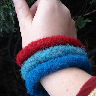
after:

i'll be honest, i'm torn on a lot of these. i like seeing stuff on models, so i like the bracelet on wrist "action shot." but there's a lot of that on etsy that i squirm when i see. specifically, hand things, as lots of us artisans don't have pretty hands. my hands personally are bashed up, scarred and often swollen. i don't think the angle on my hand in that first picture was flattering at all and the lighting shows off my new pacific northwest pallor. granted the model for the new photo is a little colorful, and i'm sure plenty of people given the opportunity to voice their opinions might say it's distracting; but that's only if i open myself up to further critique. otherwise, they'll say it safely in front of their computer screens and i'll never hear it. whether it's a good thing or bad thing, i can't say for sure. i think the light looks better in the new one, and though the colors are well represented in the old photo, they're still good in the new one. another part of the criticism that i got for some of my images was that they look too wintry, and i'm guessing it's the cool light and dark stuff in the pictures (which i like, but not everyone seems to) that is making people think of that.
carbonite before:

after:
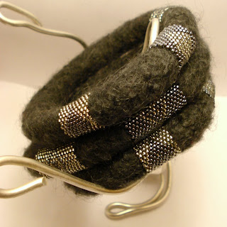 damn. i might like a lot about the old one better. i love the canteen/thermos cup in the middle. but the new picture does make them look more grey- which they are. they're not black. in the old picture, the bracelets kind of melt into the dark background, having the white behind them, i think helps them pop. which, for heaven's sake, the pictures have to pop. the wire is a sculpture i did in a college design class forever ago.
emerald city bangles before:
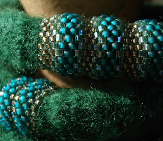 and after:
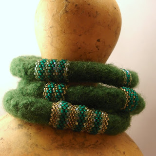 in my mind, these turned out the "best". that's the main shot right there, then i shot each of the bangles individually on the gourd. i love how refined the bracelets look and how organic and funky the dry gourd looks. these shots were the ones i clicked through several times, quite pleased with myself. there's something kind of elegant about them, but maybe i'm just full of myself. but looking at that main shot again, i'm wondering if it's still just a little too dark? how obsessed can one actually get over this thing?
another, shot number five in my shop:
 it was hard to make that one square, and i don't know how happy i am with the cropping. however, it was nowhere near as difficult to shoot and edit as this last piece.
eye carry, before:
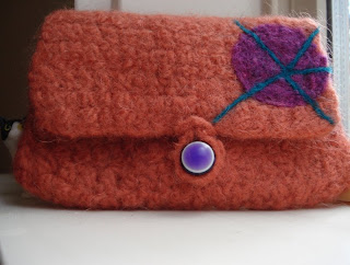
after:
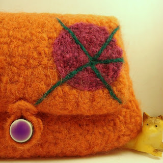 the before shot is another one of my windowsill shots, and it was working for a little bit, but the light was just too erratic. i got spoiled on that southern california light.
 this color orange is hard hard hard to photograph correctly, and the colors are still off. the orange should actually kind of be a canteloupe color. sort of. the purple is kind of close, but i don't love how warm the white in the background is.
as a whole, the shots still need work. as before, how obsessed, actually, can one get with taking pictures of this stuff? i am not a photographer, though i've wished to be in the past. there was a time when my passion for it far outstripped my talent, but honestly, the really good pictures i've taken have been few and far between. it's frustrating, because i know these things i make are beautiful in person and unless i can get the light, the cropping, the setting, etc, all just right, i don't have much luck in portraying them correctly.
*but as the trip to the farmer's market this morning also included a trip to the library, i'd rather look at those books, and worry about pictures later.*

